I've learned in this class a lot of things and leave this class with a wealth of knowledge that is beneficial to me in future courses, internships, and various jobs. I became a lot more in depth in the processes of file management in Photoshop, Illustrator, and InDesign.
There are a lot of things that I like about this class, such as the projects we have done and this course really gives you real world experience in the way things are designed, processed, printed and distributed.
My favorite project was the magazine and billboard project because I feel that I did particularly well with the designs of them both. However, all of the projects were very much a learning experience and feel that I have did well on all of them with designs and file management.
Though I will miss this class, I'll take the knowledge from this class and apply it to my future projects pertaining to my degree and skills.
Thursday, May 10, 2012
Duotone In Photoshop CS5

Before

After
The image is a four color raster and before getting your duotone raster, you must first discard all of the color from the photo by converting it into a greyscale raster. After, you are able to select the mode Duotone on the drop down menu under image mode. After, you are free to choose a color and black to create an image with class and color.
This image was taken by me.
Check out my source for more information: http://www.youtube.com/watch?v=wNItvnXt-64
Monday, April 30, 2012
Comic book artist
A
comic book artist is, for the most part, a freelance job where work is
inconsistent. They must confer with clients, writers, art directors and others
that are interested in your work. Study in different techniques to appeal to
all endeavors. Have current portfolios and past jobs to help attain new jobs.
With
this being such a specific area of skills; a secondary-education is required. However,
work experience and professional jobs should be encouraged before your years of
study are completed.
Preferred
skills and software include that of a wide range of expertise including the fields
of graphic design and fine art practices specific and mastered over the years. Years
of experience vary from artist to artist of which they can pertain prestige
fast or slow and steady.
The
salaries range from 100 to 300 dollars a page, where professionals with
prestige can demand even more; about 3 times that. Some established comic book
artists are contract base and have long-term projects. However, most are
freelance.
Check out my sources for more information:
http://education-portal.com/articles/Become_a_Comic_Book_Artist_Education_and_Career_Roadmap.htmlhttp://www.polykarbonbbs.com/showthread.php?t=23765
http://www.mymajors.com/careers-and-jobs/Comic-Book-Artist
Copyright Infringment A&M Records VS Napster

VS

Napster;
a website created for users to download music for free and file to file sharing
to other customers who used it. A&M Records brought the case to court
accusing Napster of copyright infringement on the count of them stealing music
and making it available worldwide free of charge to everybody. A&M Records
won the case in 2002 and Napster was fine 26 million dollars paid back to many
recording companies and songwriters.
Check out my source for more information:
Images from:
https://wikispaces.psu.edu/pages/viewpage.action?pageId=75448147
3D Animator
A
3D animator utilizes programs such as Maya or Blender to manipulate images to
make them move. With color, depth, texture and sound, where the only difference
being that a 3D animator doesn’t have to draw everything out as an animator
does. 3D animators manipulate the characters to transact and interact. However
they do not create the characters of which they are manipulating.
Education
requirements include a post-secondary education; a degree or certificate of
some sort. Depending on the company and how prestigious it is; the more
education is required for that company.
Preferred
skills and software include being an artist of a specific area. Skills are
varying depending on figure to background rigging and rendering. Most animators
are freelance artists and don’t have steady work. The skills and years of
experience varies dramatically from one single animator to another.
The
salary of a multimedia artist and/or animator is 56,330. However, they’re
predicting a 12% increase as there is more demand for more animators in the
near future.
Check out my sources for more information:
http://www.collegesurfing.com/content/salaries-duties-3d-animator/http://education-portal.com/3d_animation_career.html
Variable Data Programmer
A
variable data programmer organizes the direct mail based on time-critical
management skills. Also takes care of interactive databases for marketing
purposes. Manages very large mailing addresses for print, deals with corrections
and translations, and goes through testing of designs of the mail pieces as
well as other testing that is crucial for implementation of the direct mail
pieces.
Minimum
education requirements are that of Associates in business and computer science.
Preferred skills are 3-5 years in computer programming; C#, 5-10 years of
general business practices, and 3-5 years in knowledge of black/white and color
analog digital printing equipment.
Salaries
of variable data programmers range from 32,000 to 83,000 dollars based on
location and the company of which they’re associated with.
Check out these sources for more information:
http://www.bullhornreach.com/job/206814_variable-data-programmer-deerfield-beach-fl?utm_source=simplyhired.com&utm_medium=referral&utm_content=job&utm_campaign=feeds1http://www.indeed.com/salary/q-Variable-Data-Programmer-l-Seymour,-IN.html
Final Project

Thumbnails

Rough 1

Rough 2


Folding Dummy
Inside
 Outside
 Final
Final
Inside


My
purpose for this project is to entice my family, friends and others to come to
my graduation. My call to action is to create a design that will show off a
little bit of what I’ve done these past few years in college.
My
target audience is my family and friends whom are invited to come to my
graduation. The size of the invitation is 8 inches long by 2 inches wide with
.25 trim and .125 bleed. It includes a duotone, a reverse, and several four
color raster images. All images are taken by me.
Sunday, April 22, 2012
Duotone In Photoshop Elements

Before

After
Since having to continuously convert from CS5 to Photoshop Elements 9, I have to learn many ways of working with programs. Elements 9 duotone or split tone is very different from CS5. There are different ways. Elements uses a gradient to create a duotone.
Check out my source: http://www.youtube.com/watch?v=BBUz_ZyAf30 for more information.
Thursday, April 12, 2012
Logo Redesign: Pepsi

Pepsi continues to change its logo design based on American’s cultural trends during its one hundred year reign over consumers. In 1945, Pepsi created ads and changed its logo to capture the spirit of a victorious America. When America became weight conscious; Pepsi compromised once again with its logo. It soon expanded across the world in over 120 countries. When Pepsi was first introduced to the world, the design used a simple font and the color red. As the logo changed, it became a simple circle with the colors of our nation’s flag; red, white, and blue. They also changed the font to read easier for the consumer.
My opinion and the opinions of many other consumers about the logo design is that Pepsi continues to sell and continues to compromise for consumers and listens to consumers and changes to fit the consumer’s mindset and continues to entice generations to come.
Check out my source for more information: http://www.pepsi.com/PepsiLegacy_Book.pdf
Image I got from: http://www.pepsi.com/PepsiLegacy_Book.pdf
3D Text

Before

After
In CS5.1; there's a 3D mode where you can manipulate text and make it come out at you. First you choose the font of your liking. Then go to the 3D drop down menu and choose Repousse and you can choose the style and mess with depth and other things.
Check out this link: http://www.youtube.com/watch?v=hf0JjP4vo1A
Wednesday, March 28, 2012
Everyday Design


Everyday products all have a certain color theme, specific font, logo design, and production process. Depending on the target audience in which the product is being sold to.


 These product advertisements have coordinating graphics and large and simple to read font and text. Not only appealing to the lowest common denominator but enticing a hungry customer.
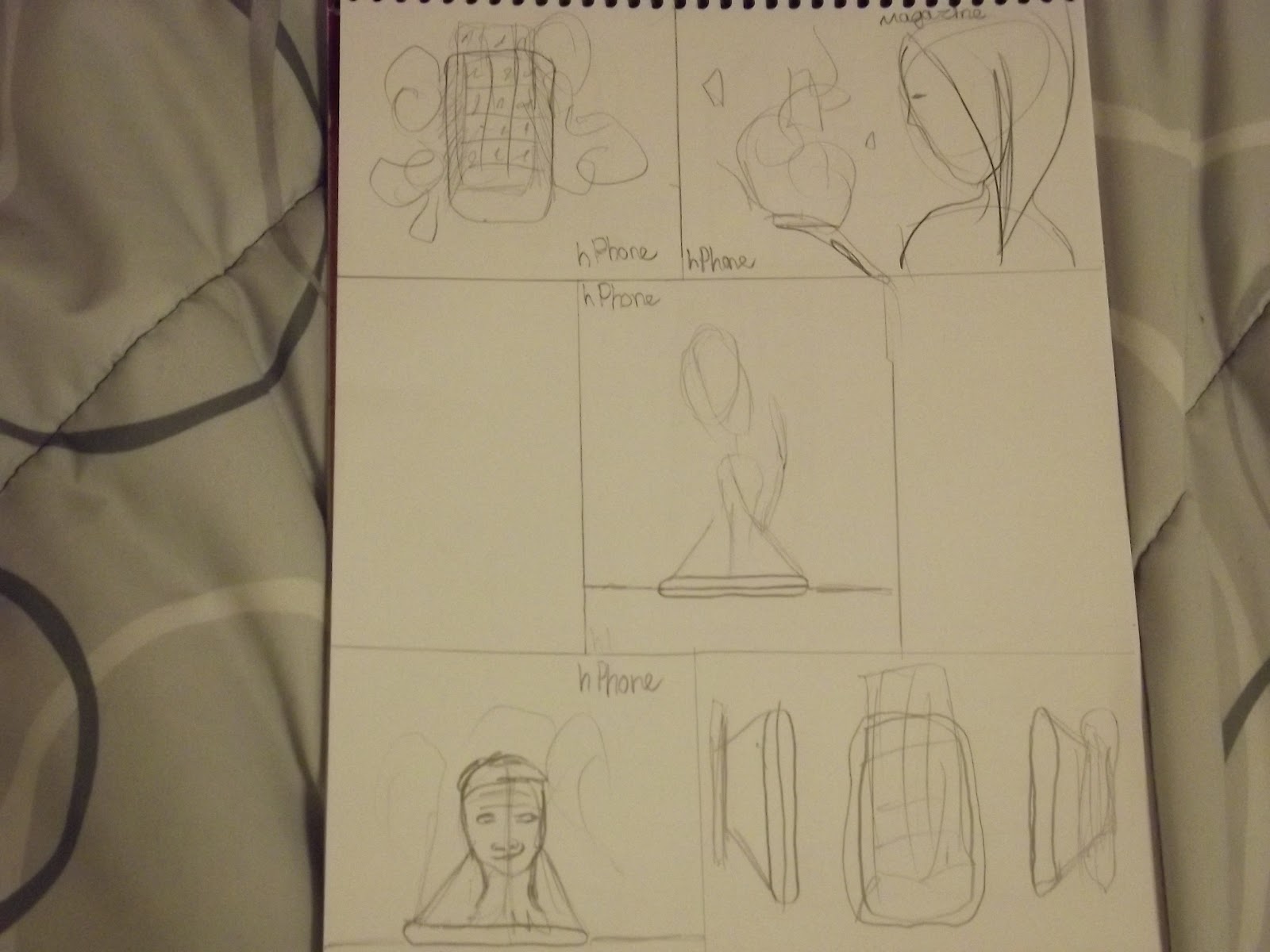
Billboard Ad
My purpose for this project is to create an extraordinary product that defies today’s standards. My new product is called hPhone; short for holographic phone. It utilizes the technology of holograms and graphics and takes communication to a new level.
My target audience is future generations and our generation. My call to action is to create a product that will certainly sell to customers around the world. It also enlightens the imagination of what could be coming soon to phones and communication.


http://mjroseblog.typepad.com/buzz_balls_hype/2007/03/the_ad_man_answ_1.html is where I get the price for the billboard.

Thumbnails

Rough one

Rough two

Final
I’ll be making this ad in Photoshop and saved as a tiff. It’s going to be 22 feet 8 inches by 10 feet 5 inches. My color mode is going to be CMYK for print and I’ll have a bleed of 1.5 inches. I’m going to have a duotone raster and vector art featured in this ad. All images are created by me. It would cost me in a big city like LA 20,000 dollars a week to have it up on the freeway. However, it varies from city to city and town.
Magazine Ad
My purpose for this project is to create an extraordinary product that defies today’s standards. My new product is called hPhone; short for holographic phone. It utilizes the technology of holograms and graphics and takes communication to a new level.
My target audience is future generations and our generation. My call to action is to create a product that will certainly sell to customers around the world. It also enlightens the imagination of what could be coming soon to phones and communication.
Thumbnails

Rough one

Rough two

Final
I’ll be making this ad in Photoshop and saved as a tiff. It’s going to be 7 7/8 inches by 10 1/2 inches; which is a full page in a magazine. My color mode is going to be CMYK for print and I’ll have a bleed of 0.25 inches. I’m going to have a four color raster and vector art featured in this ad. All images are created by me. It would cost me 1,895 to have it published in a magazine. However, it varies from magazine to magazine.
Saturday, March 17, 2012
Bitmap

Before

After
When creating a bitmap image on Photoshp CS5; it's very simple. First you convert your image to greyscale mode and then it will give you the option to convert it to bitmap where all color and grey is eliminated replaced by solid black and solid white. Bitmap images are pixel dependent.
For more information check out: http://www.youtube.com/watch?v=ZgXvxTIGwlQ
Friday, March 9, 2012
Content Aware

Before

After
Content aware is an absence of an object that was previously in the image. Only in Photoshop you are able to subtract an object that was once there in the image. First you take the lasso tool on your tool bar and outline your object for deletion.
After, you go to Edit < Fill on the drop down menu and a screen pops up where you select the content aware in the first selection bar. Once you hit ‘OK’, the image magically disappears replaced by the background on which the image was placed. You can touch up your new image with the Clone Stamp tool on the tool bar and it was like the object never existed in your image.
Is my source. Image i got from istockphotos.com; free image.
Friday, March 2, 2012
Master Image List Descriptions
Bitmaps are also called ‘line art images.” That only contains solid black and solid white. You scan your previously drawn image into your computer and produce high resolution images.


A reverse allows you the option of showing paper through your design or image that then can be used in any color mode and file.
.jpg)
.jpg)
Vector art is created in Illustrator and has an unlimited amount of resolution and can also be converted to CMYK or RGB.


A duotone raster is composed of black and a spot color which the black shouldn’t be altered in any way when planning to print.


A grayscale raster is a mode in which all other color is expelled and there is no complete black or complete white only shades of gray.


A silhouette raster eliminates the background from an image and only leaves the important content left in the image.


A full bleed raster includes the official bleed on all sides of your document. A four color raster includes CMYK value raster that is completely colored.


Screen tint is in CMYK and only uses processed colors whereas grayscale isn’t exhibited, only converted to black.

Newspaper Ad
My purpose for this project is to create newspaper ad enticing college students to showcase their musical talent and skill. My target audience is college students of any major and age.
My call to action is to provide a safe and fun place to set up and play for free and invite others for a concert that must be previously scheduled and also have free nights where anyone can attend, play, watch, and eat.
My budget for creating this ad to put in the newspaper is 97 dollars. I have a size restriction that almost meets this budget.
My budget for creating this ad to put in the newspaper is 97 dollars. I have a size restriction that almost meets this budget.
Here is my formula for figuring the cost of my project: col6 x 4”= 24 x $4= $96
This project has to be in black and white.
There are many things on the master image list I must do this project from including bitmap, vector art, and grayscale raster. All images are done by me; Rose. This project has to be in black and white.

Thumbnails

Rough

Final
Thursday, February 23, 2012
InDesign and Acrobat Tips
When placing graphics and images into InDesign; you say File>Place. Select multiple graphics and text files by shift-clicking.
Dragging and dropping images and graphics in InDesign; File>Place as well to get your image and a legitimate link. Also you can drag and drop from Adobe Bridge which these are the right things to do. Copy and pasting into InDesign leads you to no direct editing because there’s no link.
The links panel is very helpful when seeing your links updated. A yellow triangle by your placed graphic or image means that your placed graphic or image needs to be modified. A red stop sign means that your link is missing and it needs to be corrected.
Transforming graphics is a great way in getting the desired size you wish. By using frames that are automatically on the graphic once placed into InDesign. It can change the size and proportion by using the select tool, the scale tool, and the free transform tool. The selection tool allows you to move the frame and graphic around your document. The scale tool allows you to scale it proportionately, and the transform tool advances it by rotating and switching from horizontal and vertical.
Drop shadows in InDesign and Illustrator are very easy to get as it’s only a click away for simple drop shadow effects. Photoshop, however, let’s you further customize a drop shadow in the shadow effects drop down menu.
In InDesign, there is a color panel and a swatches panel. Colors created in the colors panel are not stored in the swatches panel. There is further inflexibility with color modes in the color panel with only CMYK, RGB, and Color Lab, however, it’s quick and easy. From swatches; it’s wise to pick from Pantone, Toyo, and Truematch colors as well as more color modes and it gives you the option of having spot colors or processed colors.
The Ink Manager fixes spot-color errors and inaccuracies by remapping extraneous colors to correct inks.
PDFs are often exported into Acrobat from InDesign or Illustrator. After, there are many options in which accompany a PDF.
There are many settings in which a PDF has to choose from. PDF versions, down sample/threshold, compression image quality, color policy, and description.
PDF/x-1a: 2001, is the best choice when given no specifications for a PDF file creation. Also the PDF is easy to manage with a wide variety of devices.
When you want to keep all of your layers, transparencies, or interactivities with Photoshop, you must export the document. However, using Distiller is favored by some print companies; however, exporting is much faster than distilling.
Editing in Acrobat after exporting your PDF file is limited because it maintains the document integrity. They’re supposed to be finished files, ready to ship.
Check out my source: Print Production with Adobe Creative Suit Applications for more information.
Thursday, February 16, 2012
Microsoft Tags
Microsoft tags are on much of every advertisement and media. They include barcodes, QR codes and other recognition technology. All you have to do is scan it through your phone much like QR codes in that respect.
Generating a tag can take up to five minutes. They are created through your Microsoft Live ID. After, download your tag and then you are ready to market your materials.
With the popularity of QR codes; Microsoft tags began to track and you are able to track even how many scans your tag receives and which advertisement your tag was scanned.
Check out http://tag.microsoft.com/what-is-tag/custom-tags.aspx http://tag.microsoft.com/what-is-tag/custom-tags.aspx http://tag.microsoft.com/what-is-tag/benefits.aspx http://orangeqr.com/microsoft-tag-tracking-now-available/ and http://tag.microsoft.com/home.aspx for more information.
There are many reasons to use a Microsoft tag. Seize the moment, keeping it simple for everyone, stretching your dollar, and dive into the data. Also creating flexibility in designs and experiences, and taking complete charge of campaigns.
Custom tags are eye catching. Loescher; a very large text book publishing company, Ciara and Jake Gyllenhaal have their own Microsoft tags as well.
Printing, Photoshop and Illustrator
A customer service representative (CSR) for short gives you an insight to your special print jobs.
When producing print jobs; communication is key to a successful job. In other words, talk to your printer, which is probably a sales person. Talk about potential problems that can occur during your printing job.
When planning for print; there has to be a certain important specification such as external document size and adequate bleed. As well as internal panel sizes, artwork interactions with folds, perforations or die cutting. Correct number of pages and correct inks are essential.
Also, check any raster or vector for resolution; usually 300 ppi, color space and filename. Vector artwork is somewhat similar; make sure you have correct colors, images, fonts, texts, and bleeds.
There are proofs for identifying an image and page proofs that allow the work flow of your print service provider, signing off on proofs mean that you’re satisfied with the work.
When rotating in Photoshop, you can be more successful than in page-layout software such as InDesign. Usually performing a single rotation is recommended for the least amount of erosion on your images.
Usually resolution for a document of any size should be high when printing, 300 ppi is appropriate for any size. For clean, clear, and crisp details in an image or vector artwork.
Color space in Photoshop includes vanishing pint, texturizer and artistic filters; they are not available when converting to CMYK. RGB has more flexibility.
Layered files in native Photoshop are favored by InDesign and Illustrator. However, if a Photoshop file grows too large (hundreds of megabytes), it would be wise to flatten the Photoshop document.
Transparency refers to a special effect in Photoshop such as the opacity of a document or image.
Creating a path is easier said than done when in Photoshop. Because Photoshop doesn’t offer a preview of paths.
A duotone is composed of two colors that are usually black and a spot color. Any white that is present in an image is the paper itself.
Art boards are imaginary pieces of drawing paper that can be extended beyond the scope of the white paper. When creating a new Illustrator document, an art board is automatically created.
When creating an Illustrator document, you are given the option to create a bleed and specify the bleed. Bleeds can be asymmetrical and have up to one inch in depth.
There are benefits to simplifying artwork when RIPs are concerned to make processing and efficiency more accurate. Just choose object>path>clean-up to erase stray points and empty text paths.
In Illustrator, effects are divided into two sections; Illustrator effects and Photoshop effects. Illustrator effects are applied to the interiors and edges of vector images. Clipping masks are also included for placed images.
Transparency in Illustrator includes the opacity and blending. They create interesting visuals between objects. Be sure to use carefully, however, as it may create undesirable results.
Linking and embedding images is a choice in Illustrator. Linking results in a smaller file while embedding makes it easier to keep track of all of the components of a file.
Check out Print Production with Adobe Creative Suite Applications : chapters 8, 9, and 10
Check out Print Production with Adobe Creative Suite Applications : chapters 8, 9, and 10
Sunday, February 12, 2012
Variable Data Mail Project
My purpose for this project is to get people interested in the Pittsburg Art Walk. My two target audiances are Graphics Arts majors and Fine Art majors.


Final My call to action is to get more people to attend the Pittsburg Art Walk. 5X7 with margins and bleeds.

Outline

Thumbnails

Roughs

Wednesday, February 8, 2012
Fonts and Cross-Platform Issues
PostScript; once to be known as the ‘Only Right Way’; where others were pronounced evil, because RIPs couldn’t handle TrueType. PostScript consists of a bitmap; for onscreen display and a printer component that contains instructions to print.
TrueType fonts only contain a single file for both components for onscreen and print. However, early RIPs couldn’t translate TrueType, making for errors in converting the fonts.
Open Type; also single file fonts that do not have separation from print to onscreen to keep track of. However, there is more variety of fonts to choose from with 65,000 glyphs. Adobe has done away with PostScript fonts and only utilizes Open Type fonts with enhanced typographic features and linguistic support.
A font family takes fonts and creates division among a certain font; making it italic, bold, and underlined, given the specific qualifications of that font.
Glyphs are specific and distinct letterform. In other words, multiple glyphs can exist for a single character of a font in Open Type.
Dfonts are just another name for TrueType fonts and are data-only and single filed. Helvetica, Helvetica Neue, and Times Roman are included and called dfonts.
A nightmare for prepress is Multiple Master Fonts in which the user creates multiple weights, angles, and widths of a certain font. A pretty good idea at the time, but soon died as printing servers couldn’t handle the complexities of it all.
EULA; End User Licensing Agreement, allows you to purchase fonts under their strict licensing agreements. To legally take a copy of a font to a print service, it must be license. As well as selling it to a client, the client must have license of that font as well, or it’s in violation of EULA.
File naming is a lot more complicated than you think, Windows and Macs have restrictions on the number of characters a file name can have. However, they’re a lot more generous than the old days of just eight character naming. You have wiggle room of about 255 characters extending for a file name. But, punctuation and spacing isn’t needed when naming a file, usually an underscore or capitalization is acceptable for easy file finding.
In the old days of Macs, file extensions weren’t needed when naming a file. Today, it’s needed to differentiate locations and program specific for the document. Usually file extensions are automatic when naming a file.
Open Type fonts are completely cross-platform to both Windows and Macs. Others such as TrueType and PostScript can run into problems and errors when to cross-platform them.
I found this information in Print Production with Adobe Creative Suite Applications: Chapter’s six and seven.
Thursday, February 2, 2012
Copyright

There are many things that have copyright, even images and content on the internet. Copyright parameter describes the identification on the internet, a packaged file that can be viewed of copyright information.
Fonts are even copyrighted to certain companies as to branding rights. Once you purchase a font, it’s not really you that now owns the font to do as you please with it. You cannot make a profit on your newly purchased font. Fonts also have to be purchased separately per user; including clients whom you’re selling your design and font to. If not, it’s a violation of licensed agreement between logo designers and typeface designers.
Most images on the internet that you get are from Google or Wikipedia. However, they’re all copyrighted under creative commons. Also, copyright free images actually mean public domain; which is far from completely free. There are varying degrees of copyright restrictions of images either on the internet or photographs, graphics, and illustrations. Always assume that every image you see is copyrighted unless otherwise specified. Painting a photograph to the exact and also copying a style of another is also in violation of copyrights.
With content, such as logos, music, graphics and writings, fallow limitations and restrictions of copyright laws. ‘Works of Authorship’ and originality are protected by copyright. It first must be fixed. Copyright arises automatically when a work is published.
Intellectual property refers to a company or any institution’s trade secrets, basic policies, procedures and even employee’s know-how; like manufacturing procedures. Copyright of these things protects the articles, procedures, and expression of an idea, but not the idea itself. However, one can sue for copyright infringement based on the written statement if it’s registered.
Online content and images are less restricted as it’s a vast network. Though it is much easier to access content and images, everything is copyrighted under creative commons and public domain. Even heftier copyright laws are enacted on the internet such as fonts, logos, images, and music.
Check out http://www.graphicdesignforum.com/forum/showthread.php?t=51200 http://www.csoonline.com/article/204600/intellectual-property-protection-the-basics
http://mojo.codehaus.org/rpm-maven-plugin/ident-params.html for more information as these are the sources i got this information from.
Subscribe to:
Comments (Atom)